Author


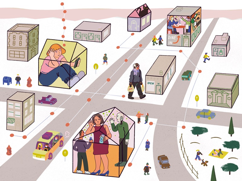
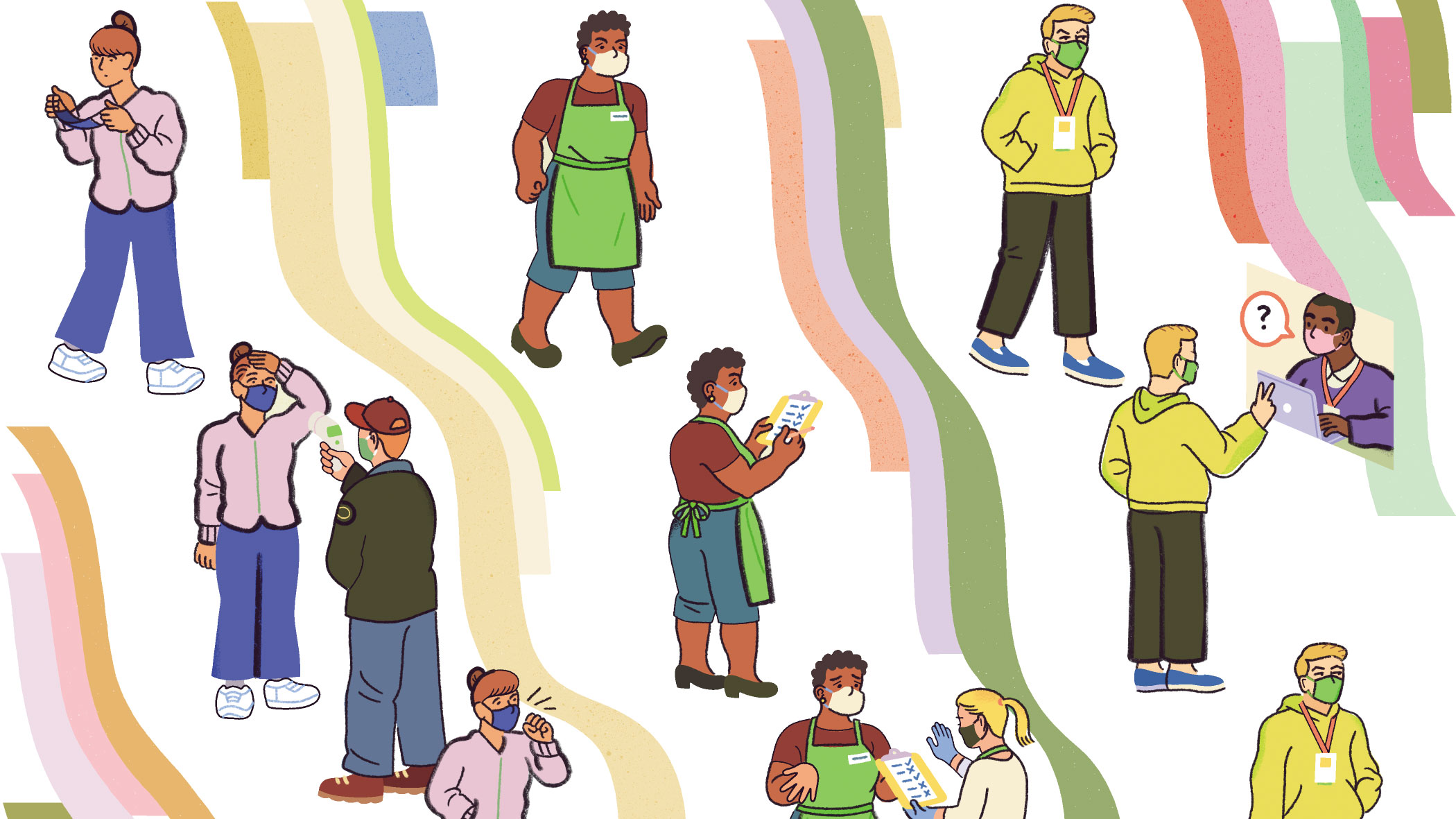
“Shelter in place.” “Social distance.”
These simple phrases express something deeply profound: human behavior to defend against a deadly infection. Their inverses, “human movement” and “social contact,” convey equally weighty concepts: the likely route and speed of viral transmission.
Mapping that route and measuring its speed are the objectives of an ongoing project by former Institute visiting scholars Jonathan Dingel of the University of Chicago and Kevin Williams from Yale, along with three colleagues. In a recent Institute working paper, they describe a rich data set they’ve created expressly for measuring human movement and social contact in the United States. And they make their data and analytical tools publicly available so that other researchers can readily use them for pandemic-related research.
The data are pinpointed, time-stamped pings emitted by smartphones, the highly personal devices that most Americans carry, almost always and everywhere. By geolocating and clocking each ping, the researchers determine each phone’s whereabouts: Where is it? What time is it? Is it in a different location than when it last pinged? (A rigorous research protocol protects phone user privacy.)
A phone that doesn’t move for days on end suggests an owner sheltering in place, by chance or intention. But pings that leave a trail show, like breadcrumbs, that its owner was on the move. The scholars also gauge each phone’s proximity to other phones, yielding evidence of potential human interaction.
Movement and proximity are summarized by separate indexes, and the paper traces the paths of each index to paint a portrait of the nation’s population during the first months of the pandemic. Where and when did we move, and were we close to others?
STUDY AUTHORS
VICTOR COUTURE, Assistant Professor of Economics, University of British Columbia; JONATHAN I. DINGEL, Associate Professor of Economics, University of Chicago Booth School of Business; ALLISON GREEN, Ph.D. Candidate, Princeton University; JESSIE HANDBURY, Assistant Professor of Real Estate, Wharton School, University of Pennsylvania; KEVIN R. WILLIAMS, Associate Professor of Economics, Yale School of Management
In brief: Both indexes show major declines in travel and personal visits in March and April 2020, but regions varied significantly. Travel from New York County to other counties collapsed in March, but not from Houston (Harris County) to elsewhere in the South and Southwest. Phone owners from areas with highly educated residents decreased travel and social contact at disproportionately high levels.
These and other preliminary findings in the paper are intriguing in themselves, but even more so as indicators of the database’s power. For epidemiologists, economists, other researchers, and policymakers who seek information about how people are moving in relation to one another and, therefore how the virus may spread, the new database and indexes provide real-time roadmaps of the American pandemic.
Do the data represent U.S.?
The paper begins by describing database details—data sources and how they create the indexes, for example.
The researchers are meticulous in excluding extraneous or unreliable data, and in reporting limitations and selection criteria. They’re also careful to protect user privacy and ensure anonymity.
Because phones are not people, there’s reasonable concern that their pings don’t accurately represent where their owners really are and with whom they share space. Moreover, not all Americans own a smartphone, and some demographic groups are more likely to have them.
The magazine of the opportunity & Inclusive Growth institute
By comparing their data with Census and other standard sources, the scholars document that, despite these limitations, their database is broadly representative of the American population.
Introducing the indexes
The researchers then create two indexes. The “location exposure index” (LEX) maps phone location over time: where a phone is, county by county, state by state. The “device exposure index” (DEX) tracks proximity to other phones—are they in the same commercial or public venue as another phone?
Both LEX and DEX are defined with the pandemic in mind. LEX describes the share of phones in a given location that pinged from elsewhere during the prior 14 days, the virus incubation period. In short, it’s the fraction of potentially infectious people who have moved between counties (or states). And DEX captures overlapping visits to venues on the same day. (Not same hour, since the virus can remain viable in the air and on surfaces for a considerable period.)
They then describe how these indexes evolved during the first months of the pandemic. It’s a fascinating picture: the evolution of social response to ongoing biological threat.
For instance, on four national maps, dated at the end of February, March, April, and May, the scholars plot the fraction of phones that had pinged during the previous 14 days in Manhattan, an early COVID-19 epicenter. The February 29, 2020, map documents substantial nationwide exposure to incoming New York County visitors. By the end of April, the map reveals dramatic decline in travel from Manhattan.
The DEX maps tell a similar story. By late March, overlapping visits in U.S. counties declined across the nation to just one-third the levels seen in early February. By late April, visits had increased somewhat across the country, but even through late May, they remained lower than in early February, particularly to New York City, California, and Washington.
A living database
Ultimately, the paper serves as an introduction to a powerful living database that reveals how we’re responding to the threat of contagious disease and death, whether by limiting our travel and visits with others or returning to life as we once knew it. By building and sharing this database, maintained with daily updates, the scholars have provided a valuable tool for others to adapt for their own research and policy aims.