Author


Americans have experienced steady, gradual improvement in their standard of living since nearly the founding of the country. Each aging generation has regaled its children with nostalgic stories of difficult childhoods before the latest advances and income gains made life better. Even the Great Depression was only a temporary, though traumatic, pause in this progress—income per person was 50 percent higher by 1949 than it had been in 1929. Most Americans have long taken it for granted that their children's lives would be better than their own.
Has this agreeable tradition come to an end? Numerous recent commentaries conclude that it has, at least for “middle America"—the broad swath of people who live well above poverty but well below opulence. These articles are supported by statistics showing slow-growing—even falling—wages, and little growth in household income over the past 30 years. It's a pretty gloomy scenario.
But perhaps the past 30 years haven't really marked the end of two centuries of steady progress for average Americans. Statistics summarizing performance of the national economy tell a very different story. Gross domestic product per person, one of the mostly widely cited proxies for standard of living, has nearly doubled since 1975. Other measures of national economic performance, such as personal income, compensation of employees and the amount of goods and services consumed, have also risen substantially.
In brief, it seems that individual workers and households have experienced stagnation, while the national economy has grown robustly. How can it be that these two sources of data—microeconomic data on individual wages and household income, and macroeconomic statistics covering the national economy—lead to such different conclusions? Since a nation comprises a group of individuals, these statistics would seemingly be compatible.
Economists offer two competing explanations for the apparent dichotomy. One explanation leans on the widely reported increase in wage and income inequality over the past 30 years. According to this view, huge economic gains made by the most prosperous Americans have driven the large average increases reported in the national statistics, while middle America has stagnated. Average income figures are bumped up when people like Bill Gates get even richer, but his income has virtually no impact on the median figure. The alternative explanation argues that the microeconomic statistics paint an inaccurate picture of the gains made by middle America, and that the gains of the affluent alone cannot account for the substantial economywide growth.
This article is the first in a series of three in The Region examining the economic progress of middle America since 1975. The goal of this series is to clarify and resolve the apparent disconnect between microeconomic statistics (using data on individual persons or households) showing stagnation and macroeconomic statistics (using national data) showing substantial growth. By disentangling the confusing web of data, I hope to provide a clearer picture of just how well middle America has fared over the past 30 years.
In this first article, I look at the change in hourly wage rates. In subsequent articles, I will examine growth in household income and consumption. My focus will be middle America, meaning a wide set of people, or households, in the middle of the distribution of wage rates or incomes. The median, or exact middle, observation (in terms of wage rates or income) is often used as a stand-in for middle America. But I will look outside the exact middle to see whether findings for the median hold for the wider group of middle Americans.
Here's a glimpse of the key findings from this article on wages. Microeconomic statistics showing stagnation, and macroeconomic statistics exhibiting growth, measure "wages" quite differently. When the data are adjusted so that they more closely measure the same conceptual object, the disparity between the microeconomic and macroeconomic statistics largely evaporates, and I find that labor income per hour for middle America has not stagnated. Rather, the economic compensation for work for middle Americans has risen significantly over the past 30 years.
Stagnant or growing wages?
To repeat, this first article focuses on hourly wages. And the goal is to understand how it is that two microeconomic series on individual hourly wage rates show little, or even negative, growth over the past 30 years, while the macroeconomic series on national labor income per hour shows significant growth. The hourly wage rate discussed here is computed using salaried workers as well as workers paid by the hour. The hourly wage rate for salaried workers is calculated as the weekly wage divided by weekly hours worked.
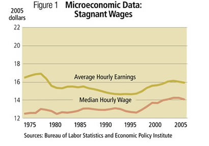
Figure 1 presents two of the most widely cited wage series indicating stagnation—median hourly wage from the Economic Policy Institute (EPI) and average hourly earnings (AHE) of production and nonsupervisory workers from the Bureau of Labor Statistics (BLS). From 1975 to 2005, median hourly wages increased a slight 12 percent, while AHE actually fell by 4 percent.
In contrast, Figure 2 shows that labor income per hour for the national economy grew substantially over the same period, rising by 39 percent.1, 2
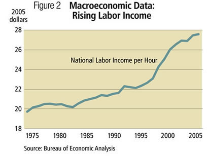
How is it that the microeconomic hourly wage series show little growth (12 percent) or no growth (-4 percent), while the national data indicate significant growth (39 percent)? The three data series are in fact quite different in terms of how they adjust for inflation, what labor income each includes, which workers they cover and other measurement issues. In short, Figures 1 and 2 compare wage rates that are not really comparable-an apples-to-oranges comparison, if you will. The following analysis makes a few simple adjustments to the wage series that allow for a more informative apples-to-apples comparison of the data.3
Inflation matters
The wage series shown in Figure 1 are all adjusted for inflation and presented in 2005 dollars. However, there are many measures of inflation, and each data series uses a different one. Furthermore, the inflation measure chosen has a notable impact on the size of inflation-adjusted wage growth.
Table 1 lists the price index used to remove the effects of inflation from (or to "deflate") each series, along with the cumulative and annualized rates of inflation over the 1975-2005 period. AHE is deflated using the consumer price index for all urban wage earners and clerical workers (CPI-W), while the median hourly wage series is deflated by splicing two other CPI series, the consumer price index for all urban consumers (CPI-U) and the consumer price index for all urban consumer research series (CPI-U-RS).4 Finally, national labor income per hour is deflated using the personal consumption expenditures (PCE) implicit price deflator.
The inflation rates implied by the three price indexes differ notably. While the average annualized rates are similar, the cumulative effect over 30 years is not so modest. Inflation as measured by the CPI-W index is more than 40 percentage points higher than inflation as measured by the PCE deflator.
The first step in moving toward an apples-to-apples comparison is to deflate all series using the same price index. I've chosen the PCE deflator because it provides a consistent series back to 1975 and because it reflects the basket of final goods and services that people consumed each year.5
Table 2 presents hourly wage rates for 1975 and 2005 using both the original price index for each series and the PCE deflator. Entries for national labor income per hour do not change since the PCE deflator is the original price index used for that series. Furthermore, none of the 2005 entries change since all series are measured in 2005 dollars regardless of the price index used. The effect of the change in the price index is seen in the 1975 entries. Average hourly earnings in 1975 are 12 percent lower using the PCE deflator ($14.67 versus $16.70), and the median hourly wage is 6 percent lower ($11.93 versus $12.71).
Using the PCE deflator for all series therefore changes the growth rates noticeably. Average hourly earnings now increase by 10 percent rather than declining by 4 percent. Median hourly wage rises 20 percent rather than 12 percent. Almost a third of the difference in growth rates between the national labor income series and the two microeconomic wage series vanishes simply by using the same measure of inflation.
Adding benefits
Fringe benefits have become an increasingly important part of employee compensation over the past 30 years. The BLS estimates that benefits currently account for about 30 percent of employer costs for employee compensation. While the BLS does not provide similar estimates for 1975, other sources suggest that the benefit share of total compensation has risen substantially. For example, the Economic Benefits Research Institute estimates that health care as a share of total compensation rose from 3.3 percent in 1975 to 8.5 percent in 2005.
Since the underlying interest in this article is the standard of living, and fringe benefits contribute to workers' well-being, benefits should be included in the measures of labor compensation. Benefits are not included in the two microeconomic series on wages. This is not an error; the series are designed to measure income from wages and salary only.
National labor income per hour, on the other hand, does include wage supplements (benefits) as defined by the Bureau of Economic Analysis national income and product accounts. NIPA wage supplements include employer contributions to employee pension and insurance funds and employer contributions to government social insurance, but exclude benefits such as paid leave that are included in the BLS estimate mentioned above. Wage supplements per hour rose a substantial 90 percent from 1975 to 2005 and increased as a share of total NIPA compensation, wages and salary plus supplements, from 14.2 percent in 1975 to 19.4 percent in 2005.
The next step in making the wage series comparable, then, is to add benefits per hour to the existing series on average hourly earnings and the median hourly wage. Unfortunately, precise data on benefits at the individual level are not readily available. To get a sense of the magnitude of the impact of including benefits, I estimate benefits per hour for these series based on NIPA data.
Estimates of benefits per hour for each wage series are constructed by assuming that the ratio of benefits to wages is equal to the ratio of NIPA supplements to NIPA wages and salaries for a corresponding set of workers in the NIPA data.6 Table 3 shows the result of adding benefits under this assumption.
Including benefits in the microeconomic wage series further reduces the discrepancy between the growth rates of these series and the national labor income per hour series. Including estimated benefits adds 6 percentage points to the growth rate of average hourly earnings and 8 percentage points to the growth rate of the median hourly wage.
To recap
Just two adjustments—using the same price index and including benefits—have greatly diminished the growth rate differences between the microeconomic and macroeconomic series. Rather than falling by 4 percent over the past 30 years, average hourly earnings have actually risen by 16 percent. Growth in the median hourly wage went from 12 percent to a more respectable 28 percent.
Still, the growth rate for each of the micro series remains noticeably below the 39 percent growth rate in national labor income per hour. This is especially true for average hourly earnings. The next two sections take up these remaining differences, starting with average hourly earnings.
The AHE enigma
While two adjustments to average hourly earnings turned a small wage decline into a modest wage increase, growth of average hourly earnings remains substantially slower than growth in the national labor income figure. Why? Economists have not come up with a definitive answer, but part of the reason lies in the inexplicably slow trend growth of AHE relative to trend wage growth based on a variety of other data sources.7
Why is AHE growth slower than wage growth from other data sources? One possible explanation is simply that the group covered by this measure—production and nonsupervisory workers—has, in fact, experienced slower wage growth than other groups of workers. But when other sources of wage income for production and nonsupervisory workers are examined, they continue to reveal higher wage growth trends than the AHE series. Researchers suggest that there may be some confusion as to exactly which employees are included under the BLS definition of "production and nonsupervisory workers."
In response, the BLS is currently in the process of overhauling the average hourly earnings series to "improve its relevance to the needs of data users." The new series will include data on all private, nonfarm employees, and by early 2010, the BLS plans to discontinue the AHE series for production and nonsupervisory workers altogether. These changes by the BLS, and the anomalous behavior of AHE, suggest that other wage measures are better suited for gauging the wage progress by middle America.
Median vs. mean
Setting aside the puzzling AHE series, I still seek to understand the remaining differences between the median hourly wage rate series and national labor income figure. The primary focus of this article is on growth rates, and the median hourly wage plus benefits growth of 28 percent remains noticeably lower than the 39 percent growth in national labor income per hour. The distinction between the statistical concepts of median (the middle) and mean (the average) accounts for most of the remaining difference.
As noted, some economists have argued that relatively large wage gains at the top end of the wage distribution drove the increase in average wages, while median wages grew little if at all. I have shown that, in fact, median wages increased appreciably since 1975—by 28 percent—once benefits were included and a common price index was used. However, this does not contradict the claim that wage inequality increased over this period—it did. The EPI analysis finds that PCE-deflated hourly wages at the 90th and 95th percentiles rose by more than 40 percent from 1975 to 2005, twice the growth seen in the median wage (20 percent).
The comparatively rapid growth of wages at the top end of the wage distribution suggests that the mean growth of hourly wages will exceed the median growth rate. Calculations using individual hourly wage data indicate that the mean growth rate exceeded the median growth rate by roughly 10 percent to 14 percent over this period.8 That difference does not explain most of the increase in national labor income per hour (an average), but it is enough to cover the remaining 11 percentage point spread between the median and national labor income growth rates. In fact, it may adjust by too much, and other data considerations might work in the opposite direction.
The distinction between median and mean also largely accounts for the difference in the levels of the median hourly wage and national labor income per hour; Bill Gates pulls up the mean much more than the median. Other factors also contribute, such as differences in what income is included and what population is covered.9
To summarize, the initial difference between the median hourly wage rate and national labor income per hour has all but vanished. Adjusting for differences in price deflators, including benefits and noting the impact of median versus mean have eliminated the initial micro/macro data conundrum. This microeconomic wage series is quite consistent with the corresponding national data.
Outside the median
I've established that wages for the median worker went up by 20 percent between 1975 and 2005, while wages plus benefits increased by around 28 percent. How did the workers above or below the median fare? The wage figures computed by the EPI, which exclude the substantial growth in benefits, indicate they did fairly well. The 40th and 60th percentiles of hourly wage rates rose by 18 percent and 21 percent, respectively. As indicated in the preceding section, the wage gains are much larger at higher wage rates.
Large gains at the top end of the wage distribution might seem to be accompanied by flat wages at the bottom, but that is not the case. Wage gains at the lower end of the distribution held up fairly well. Wage growth rates at the 10th and 20th percentiles were only slightly below the median growth rates, increasing by 17 percent and 18 percent, respectively. While these data confirm that wage inequality increased since 1975, they also confirm that a broad swath of middle America experienced notable hourly wage gains.
Findings
I've tried to explain how two frequently cited microeconomic wage series could show stagnation over the past 30 years, while macroeconomic data on labor income exhibited substantial growth. My main finding is that the microeconomic and macroeconomic facts are, in fact, compatible and that the microeconomic wage series grew notably once a common price deflator was used and benefits were included. The slow growth in the average hourly earnings of production and nonsupervisory workers is an anomaly that is not well understood; other microeconomic wage series show stronger growth. The 28 percent growth in median wages plus benefits is consistent with growth in national labor income per hour once the difference between medians and means is accounted for. Furthermore, similar wage growth occurred for a wide range of workers around the median.
While 25 percent to 30 percent growth in hourly compensation is not stagnation, it also does not qualify as robust growth by historical standards. In coming articles, I will take a closer look at growth in household income and consumption, trends that provide evidence of stronger growth in middle America's standard of living.
Endnotes
1 Labor income is defined using data from the Bureau of Economic Analysis national income and product accounts. Labor income equals compensation of employees plus 70 percent of proprietor's income. This definition of labor income is standard in the macroeconomics literature. See Chapter 1 of Frontiers of Business Cycle Research, 1995, Princeton University Press (edited by Thomas F. Cooley) for a discussion. The hours series used is based on the Current Population Survey. Details are given in Prescott, Edward C., Alexander Ueberfeldt and Simona Cociuba, "U.S. Hours and Productivity Behavior Using CPS Hours Worked Data: 1959-I to 2005-II," 2005, manuscript, Research Department, Federal Reserve Bank of Minneapolis. One advantage of using hours derived from the CPS is that the median hourly wage series is also based on CPS data, so that differences in the underlying hours data between the measure of aggregate labor income per hour and median hourly wage are limited.
2 National labor income per person rose 75 percent over this period, much more than the 39 percent increase in income per hour. The difference is attributable to a rise in the fraction of people working—women in particular—and to an increase in annual hours per worker, mostly in weeks worked per year. The focus of this article is on hourly wage rates. The next article in this series will focus on annual household income.
3 For useful discussions of the impact of differences in source data in hours and earnings in measuring hourly wages, see Abraham, Katharine G., James R. Spletzer and Jay C. Stewart, "Divergent Trends in Alternative Wage Series," in John C. Haltiwanger, Marilyn E. Manser and Robert Topel, eds., Labor Statistics Measurement Issues, 1998, and Meisenheimer, Joseph R., "Real Compensation, 1979 to 2003: Analysis from Several Data Sources," Monthly Labor Review, May 2005.
4 See The State of Working America 2006/2007, pp. 36-7 for a discussion of the Economic Policy Institute's approach to adjusting for inflation. That procedure is followed in constructing the price index used here for the EPI series.
5 The CPI-W and CPI-U series are not revised over time to reflect many methodological improvements designed to make them more accurate. The CPI-U-RS was constructed by the BLS to incorporate these improvements into a historical series, but those adjustments go back only to 1978. These revisions significantly lowered cumulative inflation for 1978 to 2005, from 200 percent (CPI-U) to 173 percent (CPI-U-RS). The deflators used for average hourly earnings and for the median hourly wage both rely on unrevised series, though to different extents. The PCE deflator, on the other hand, is revised on an ongoing basis. Another widely used price index, the GDP deflator, produces cumulative inflation from 1975 to 2005 of 197 percent.
6 For AHE, I compute the ratio of NIPA supplements to NIPA wages for employees in domestic private industries (0.155 in 1975, 0.213 in 2005). For the median hourly wage, I use the ratio of NIPA supplements to NIPA wages for all employees (0.165 in 1975, 0.241 in 2005). I then multiply each wage rate by the corresponding ratio to estimate benefits per hour. This procedure reduces both the level and growth rate of benefits per hour for each series relative to the measure of national supplements per hour. National supplements per hour rose 90 percent from 1975 to 2005, from $2.58 to $4.89, in 2005 dollars.
7 See Abraham, Spletzer and Stewart (1998), Meisenheimer (2005) and Barkume, Anthony J. and Michael K. Lettau, "Replicate Estimates of the Average Hourly Earnings Series," Monthly Labor Review, October 2000, for useful discussions.
8 Calculations were made using data produced jointly by the BLS and the U.S. Census Bureau and provided by the Integrated Public Use Microdata Series (IPUMS) created at the University of Minnesota. Mean and median hourly wages were computed for 1975 and 2005 for all wage and salaried workers aged 15 years or older. The median hourly wage adjusted for inflation increased by 19 percent—slightly below the 20 percent figure from the EPI. The mean hourly wage increased by 33 percent over this period. However, comparisons with NIPA wage and salary data indicate that this increase in mean hourly wage may overstate actual growth. While total IPUMS wages and salaries were 99.1 percent of NIPA wages and salary in 2005, that figure was 92.3 percent in 1975. The larger discrepancy in 1975 may be due to changes in the procedure used in reporting the income of individuals with high wages. If NIPA data are used for wages and salary rather than IPUMS data, the growth in mean hourly wages is 29 percent.
9 Median wage plus benefits was $17.74 in 2005, while national labor income per hour was $27.63. Calculations using the IPUMS data referred to in note 8 indicate that the median/mean distinction accounts for about two-thirds of the roughly $10 discrepancy. Differences in data series definitions must account for the remainder. For example, national labor income includes income received by partnerships and sole proprietors; that income is not included in the median hourly wage calculations.