Abstract
In this paper, we explore the impact of the Great Recession on economic inequality and redistribution in the United States. We analyze many sorts of inequality (in earnings, disposable income, consumption expenditures and wealth) for different sections of the economic distribution.
Here we highlight three central findings.
- In 2010, the bottom 20 percent of the U.S. earnings distribution was doing much worse, relative to the median, than in the entire postwar period. This is because their earnings (including wages, salaries, and business and farm income) fell by about 30 percent relative to the median over the course of the recession. This lowest quintile also did poorly in terms of wealth, which declined about 40 percent.
- Redistribution through taxes and transfer programs reached historically high levels in 2010. As a result, spending power, captured by disposable income and consumption expenditures on nondurables, of this same lowest 20 percent did not significantly change relative to other economic groups during the recession.
- Although government redistribution protected households from fully bearing the impact of an earnings decline, households that experienced such a decrease nonetheless endured sizable drops in disposable income and drops in consumption expenditures.
Introduction1
Although there is little doubt that the Great Recession constituted a watershed for overall business cycle dynamics in the United States, the jury is still out on its distributional consequences. Did economic inequality change significantly during the recession? If so, which dimensions—income earnings, wealth and consumption—saw the largest changes? And what impact did government policies, such as taxes and transfer programs, have over this time period on both inequality and economic well-being?
Analyses focused on the first two years of the downturn seem to find no increase in economic inequality; indeed, some report a decline. For example, a recent comprehensive volume (Jenkins et al. 2011) that analyzes income distribution in 21 Organisation for Economic Co-operation and Development (OECD) countries (including the United States) across the Great Recession sees “little change in household income distributions in the two years following the downturn.” Heathcote et al. (2010b) and Petev et al. (2011) study inequality in consumption expenditures in the United States up until 2009 and also find little change (if anything, they find a decline).
A longer-term view, however, suggests that high levels of unemployment and the large drop in housing prices, both of which started during the Great Recession but persisted well after, might have had longer-term adverse distributional consequences. In particular, the recession may have left a significant fraction of the U.S. population with very little wealth (due to the fall in asset prices) and poor labor market prospects (due to high unemployment).
The goal of this paper is to paint a more complete picture of the distributional impact of the Great Recession, including more recent data from 2010 and part of 2011. Most importantly, this paper considers inequality in a wide array of variables, such as earnings, disposable income, consumption expenditures and wealth, and looks at inequality for all of these variables at different sections of the economic distribution.
Our first finding is that during and after the Great Recession, the bottom of the U.S. earnings distribution has fallen dramatically. This is the result of historically high unemployment and nonparticipation. In terms of earnings, the bottom 20 percent of the U.S. population has never done so poorly, relative to the median, during the whole postwar period. We also show that this group experienced rapidly declining wealth.
Despite this, we find that inequality in disposable income and consumption did not increase at either the top or bottom of the distribution, confirming the findings of other studies. In other words, the same bottom 20 percent of the earnings distribution that fared so poorly during the Great Recession in terms of earnings and wealth is in pretty much the same relative position in terms of disposable income and consumption in 2010, after the recession officially ended, as it was in 2006, before the start of the recession.
Such a divergence of trends in earnings and disposable income at the bottom of the distribution is unprecedented in U.S. history, and we show that it is mainly due to government transfers and taxes, as opposed to private components of unearned income.
We conclude our study using panel analysis (i.e., following a specific set of households through time) to better assess the role of government taxes and transfers. This allows us to distinguish between the experience of a given section of the income distribution (e.g., the bottom 20 percent of the distribution, whose members change each period) and the experience of a fixed group of households (e.g., those households that were at the bottom 20 percent of the distribution in 2006 but whose position may have changed by 2010. If the “Smiths,” say, were in the bottom fifth in 2006, we use panel analysis to understand where the Smiths ended up later on).
Our main finding is that although the bottom 20 percent of the earnings distribution experienced constant disposable income or consumption expenditures despite earnings losses, individual households that face earnings losses and enter the bottom 20 percent group do suffer significant losses in disposable income and small losses in consumption.
Our main substantive conclusion is that government redistribution in the Great Recession was at historical highs and partially shielded households from experiencing large declines in disposable income and consumption expenditures. The same households, though, have experienced losses in net wealth, and this might make them more vulnerable to further or more persistent earnings declines in the future.
We believe our analysis provides useful data to inform the policy debate about whether or not, looking forward, the government should take a more aggressive role in providing assistance for households that experience earnings losses.
Income inequality in U.S. recessions: Some historical perspective
We start our analysis by putting the Great Recession in historical perspective, in particular by comparing the patterns of income inequality in the Great Recession with patterns of inequality in previous recessions.
For this analysis, our data source is the March supplement of the Current Population Survey (CPS), an annual survey of about 60,000 households selected to represent the U.S. civilian noninstitutional population. The longest series that is comparable, for the purpose of our analysis, starts with the March 1968 sample (which refers to 1967 calendar year) and ends with the survey collected in March 2011, which covers incomes of the calendar year 2010. Because of our interest in the
recession, which mostly affected households in labor markets, we select only those households with at least one member between the ages of 22 and 60 years.
Throughout this paper, we focus mostly on two simple measures of inequality: the 50/20 ratio and the 95/50 ratio. These are ratios of percentiles in the economic distribution. For example, the 50/20 ratio for income is the ratio of median income (the “50”) to the income of the richest household in the bottom fifth of the income distribution (the “20”). The 95/20 ratio for earnings is the ratio of the lowest-earnings household in the top 5 percent of the earnings distribution (the “95”) to the median earnings figure.
These ratios have two advantages over other inequality indicators. First, as ratios of variables, they are easy to translate directly into inequality magnitudes and inequality changes. The second advantage is that they concisely capture inequality at the bottom and at the top of the distribution, respectively.
In terms of income measures, we first focus on three measures of household resources. The first is earnings, which includes wages, salaries, and business and farm income from all household members. The second is total income, which includes all sources of household income, including not only earnings, but also interest, dividends, rents, private transfers (such as alimony and child support) and government transfers (such as Social Security, unemployment insurance and welfare). The last measure is disposable income, which subtracts tax liabilities from total income.2 To account for different household sizes, we divide all three measures of household income by the number of “adult equivalents” in the household.3
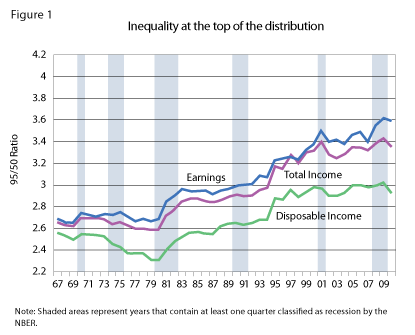
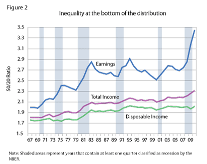
Figures 1 and 2 report the evolution, from 1967 to 2010, of the 95/50 ratio and of the 50/20 ratio for these three measures of household resources.
Figure 1 confirms the finding, highlighted by several authors (e.g., Piketty and Saez 2003), that inequality at the top of the distribution has increased substantially during the 1980s and the 1990s. It also shows that there was an increase in earnings inequality during the Great Recession. This increase was due to the fact that median earnings per adult equivalent fell quite substantially from 2008 to 2010 (from around $26,300 to roughly $24,700), while earnings of the 95th percentile have been more stable (about $89,170 to $88,640).
Notice also that the increase in earnings inequality resulted in a rise in inequality in total income but not disposable income, suggesting that taxes reduced the differential impact of the recession on the top and on the median. Overall, though, the changes in inequality at the top of the distribution were small compared with changes at the bottom, as seen in Figure 2.
The first feature of Figure 2 that we want to highlight is an extraordinary fall of the bottom of the earnings distribution. This is captured by the 50/20 ratio, which increased sharply during the recession from roughly 2.7 to nearly 3.5. Note that the 50/20 ratio rises in all recessions, which are, by definition, periods of increasing unemployment. Higher unemployment raises the fraction of households with no or very low earnings, and this causes the 20th percentile of the earnings distribution to fall relative to the median, thereby raising the 50/20 ratio.4
But note that while unemployment in 2010 was slightly below its postwar historical high,5 the 50/20 ratio in the same year was well above its previous historical high, reaching almost 3.5, while in previous recessions it never exceeded 3. This suggests that the cause for the high inequality at the bottom is not just unemployment but also nonparticipation in the labor market.
A second feature seen in Figure 2 is that the 50/20 ratios in both total income and disposable income have much lower levels and, during the Great Recession, experienced much smaller increases than the 50/20 ratio in earnings. Indeed, despite the substantial increase in earnings inequality, inequality in disposable income was about the same in 2010 as in 2003.
This lack of change is quite remarkable; in all previous U.S. recessions, with the exception of that in 1973, disposable income inequality at the bottom increased. Constant inequality in disposable income during recessions has been experienced in some European countries (Sweden, for example; see Domeji and Flodén 2010), but it is unusual in the United States. This suggests that mechanisms like private or government transfers played an important role in mitigating the effect of the Great Recession on inequality in disposable income. The next section investigates the impact of such mechanisms in greater detail.
Income inequality in the Great Recession: Getting to the bottom of it
First we look more closely into the large increase in earnings inequality at the bottom of the distribution, and then we identify more precisely the causes of the divergence between inequality in earnings and in disposable income.
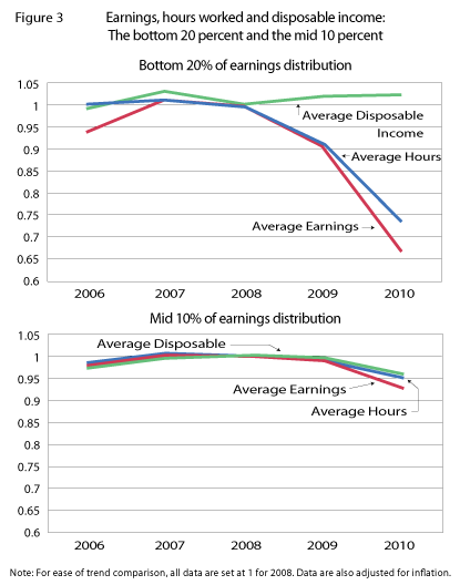
Earnings are the product of hours worked and wages per hour, and the CPS provides data on hours worked per household. Following a similar analysis to that done by Heathcote et al. (2010a) for previous recessions, Figure 3 plots average real earnings, average hours worked and average disposable income for the bottom 20 percent and the middle 10 percent of the earnings distribution. In both panels, all statistics are “normalized” (or mathematically set) to 1 in 2008.
Three features of this figure are quite striking.
The first is that the increase in earnings inequality was the result of a large absolute (and not relative) fall of earnings at the bottom of the distribution. The top panel shows that earnings at the bottom fell more than 30 percent (in real terms) from 2008 to 2010, while the bottom panel shows only a moderate 5 percent earnings fall for the middle.
The second is that the sharp fall in earnings at the bottom can be attributed largely to the decrease in total hours worked, which fell by 25 percent, and not to a possible change in hourly wage rates.
The third striking feature of this figure—evident in the top panel—is that the sharp fall in hours worked and earnings for the bottom 20 percent of households did not result in a parallel decline in disposable income.
Taken together, these three facts suggest that government and private support for unemployed individuals played a major role in muting the impact on disposable income of lower earnings and employment during the Great Recession.
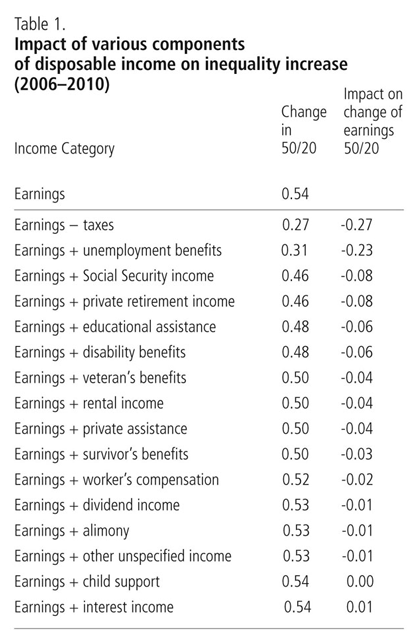
In Table 1, we analyze more precisely which components of disposable income were most important in mitigating the fall in earnings of the bottom 20 percent. To do so, we look at the increase in the 50/20 ratio when we add to earnings each of the individual components that constitute “disposable income.”
The table’s first column simply identifies each component, one by one. The second column reports the change (from 2006 to 2010) in the 50/20 ratio for the income measure that includes earnings plus the respective component in the first column. The third column is simply the second column minus the increase in the 50/20 ratio for earnings alone: The smaller the number, the more that particular disposable income component prevents a rise in inequality at the bottom. (For instance, Social Security payments, with a -0.08 impact, plays a greater role in preventing a rise in 50/20 disposable income inequality than does rental income, with a -0.04 impact.)
The rows are ranked according to the third column; the first row reduces the inequality increase the most. Not surprisingly, unemployment benefits contribute greatly to the lack of increase in disposable income inequality as do taxes (most likely through the Earned Income Tax Credit program). Overall, the table suggests that government programs, as opposed to other non-earned-income categories like interest or dividends, are an important factor in explaining why increased earnings inequality did not translate into an increase of disposable income inequality during the Great Recession.
Consumption inequality during the Great Recession
Previous research on inequality (e.g., Blundell and Preston (1998) and Krueger and Perri (2006)) has suggested that the distribution of consumption expenditures, not of income, gives greater insight into the distribution of household well-being. Financial markets permit consumption expenditures that are more closely related to a household’s lifetime resources (sometimes referred to as the “permanent income” of the household). Consumption, therefore, is a better indicator of the well-being of the household.
This logic might also be relevant in evaluating the distributional impact of the Great Recession, for two reasons.
One reason is that current consumption better reflects expectations about future income prospects than do current earnings—an individual who expects to lose his/her job may well reduce expenditures even when she/he is still employed.
We have just established that during the Great Recession, inequality in disposable income did not increase because government transfers like unemployment insurance supported disposable income of low-earnings households. But if shocks to earnings are persistent and transfers to low-income households have limited duration, then the permanent income of some low-earnings households will fall, and so we would expect to see a drop in consumption expenditure, despite stable disposable income.
The other reason consumption expenditures might be a better indicator of distributional changes is related to the fact that the defining event of the Great Recession was the large fall of asset prices, particularly of housing.
Consider two households with the same income but very different shocks to the value of their wealth. Looking only at income would not inform us about distributional changes between them, but looking at consumption would, as the households would adjust their consumption in response to changes in their net wealth. More concretely, when housing prices fall, households feel less wealthy and spend less—even when their salaries and other income streams do not change.
For these reasons, understanding the evolution of consumption distribution during the Great Recession may shed light on the impact of the recession. Here we present household-level consumption data from the Consumer Expenditure (CE) Interview Survey. The CE Survey is a rotating panel of households that are selected to be representative of the U.S. population. Each quarter the survey reports, for the cross section of households interviewed (about 6,000), detailed demographic characteristics for all household members, detailed information on consumption expenditures for the three-month period preceding the interview and information on income, hours worked and taxes paid over a yearly period. The most recent data available are from the first quarter of 2011.
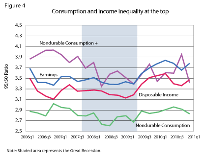
The statistics we present track closely those analyzed earlier. We start with inequality at the top, captured by the 95/50 ratio, together with inequality in earnings and disposable income (from the CE sample). Figure 4 reports measures of inequality in expenditures on nondurable goods (labeled “Nondurable Consumption”) and inequality in expenditures on nondurables plus a few durables such as cars and furniture (labeled “Nondurable Consumption+”).6
Overall, the figure suggests that despite some swings in the inequality measures, the Great Recession did not significantly change inequality in consumption for households at the top of the distribution.
Notice how, in the initial phase of the recession, inequality in both consumption measures seemed to fall; this might be simply due to the large fall in purchases of durables that took place in the middle of the recession. If many consumers stop purchasing durables, fewer large consumption expenditures are recorded and, hence, inequality at the top falls. Consistent with this hypothesis is the fact that by the end of 2010, inequality in expenditures at the top returned to the same level as in 2006.
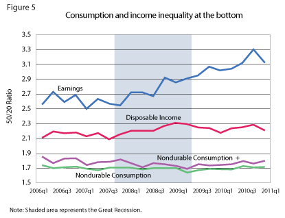
Figure 5 reports inequality at the bottom, the 50/20 ratio. The plot lines for earnings and disposable income mimic closely those observed for CPS and, perhaps not surprisingly, given the steady path of disposable income over these years, inequality in consumption barely moves during the Great Recession. Overall, Figures 4 and 5 suggest an overall stability of consumption inequality over the course of the Great Recession.
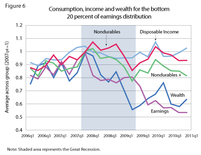
In the last part of this section, we investigate the issue further by focusing, as we did in Figure 3, on the bottom 20 percent of the earnings distribution. Figure 6 plots, for the bottom 20 percent of the earnings distribution in each quarter, average earnings and disposable income, average nondurable and nondurable+ consumption and average total net wealth, all normalized to 1 in 2007q4.
First, notice that earnings and disposable income behave very similarly to the corresponding CPS series in Figure 3. Nondurable consumption tracks disposable income closely and does not seem affected by the fall in earnings. In contrast, both the average wealth and the nondurable+ series for this group fall considerably.
It would no doubt be difficult—and certainly it is outside the scope of this paper—to establish a causal link between the fall in earnings and in wealth of this group. Nevertheless, the figure suggests that the bottom 20 percent of the earnings distribution in 2010 was a very different group than it was in 2007. The bottom 20 percent groups in 2010 and 2007 had the same disposable income, but both earnings and wealth of the 2010 group were 40 percent lower. In absolute terms, this means that the average wealth of the bottom 20 percent fell from around $80,000 in 2007 to a little over $50,000 in 2010. The lower wealth is particularly important, as it makes this group more vulnerable if government support for low-earnings households were to cease.
A panel analysis
The cross-sectional data analyzed in the previous sections show that while earnings for the bottom 20 percent of households fell dramatically over the Great Recession, disposable income in the same group was virtually constant. However, these cross-sectional data do not necessarily tell us how individual households are faring over time, since the group of households in the bottom 20 percent changes each year; some previously higher-earnings households move into the bottom 20 percent, and some households that were previously in the bottom 20 percent move out of it.
In this section, we use panel data from the Panel Study of Income Dynamics (PSID) to study the importance of two components of the bottom 20 percent group: (1) changes in income and expenditures of households that stay in the group, and (2) changes in the composition of the group.7
The PSID is the longest-running representative household panel study in the United States. The PSID data sets provide a wide variety of information on geographic location, income, employment, wealth and expenditures for many households that are followed, after 1996, at a biannual frequency. We concentrate our analysis on the 2007 and 2009 surveys (which provide data on 2006 and 2008) to study distributional dynamics since the start of the Great Recession.
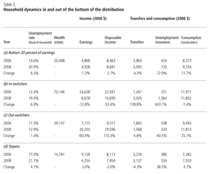
Panel (a) of Table 2 (labeled “Bottom 20 percent of earnings”) shows the results, for the PSID, of the same cross-sectional analysis we did above on the CPS and CE. In particular, we look at a series of statistics for a particular group: the bottom 20 percent of the earnings distribution.
In Panel (a), we see that earnings for the bottom 20 percent rose slightly between 2006 and 2008, by about the same amount as in the cross-sectional data in Figure 3. Disposable income rose as well. Panels (b), (c) and (d) of the table decompose, or separate, these changes into changes of the households that stay in the group (“Stayers,” Panel d), which make up about 75 percent of the group, and the difference in income between the group that entered the bottom 20 percent in 2008 (“In-switchers,” Panel b) and the group that left the bottom 20 percent in 2008 (“Out-switchers,” Panel c).
What we want to highlight is that while disposable income for the bottom 20 percent as a whole rose slightly between 2006 and 2008, this increase is due only to a change in the group’s composition. The panel analysis allows us to control for these compositional effects and shows instead that, on average, households in the bottom 20 percent of the earnings distribution in 2008 actually suffered a significant decline in disposable income.
To see this, recall that the bottom 20 percent in 2008 can be divided into two subgroups: the stayers (those who were in the same group in 2006) and the in-switchers (those who were not in the bottom 20 percent in 2006). First, consider the stayers (Panel d in Table 2) and observe that their disposable income fell by 2 percent. Then observe that the in-switchers saw their earnings fall by almost 75 percent. While transfers (especially unemployment insurance) mitigated this drop to some extent, in-switchers’ disposable income still fell by more than 50 percent. So, on average, households in the bottom 20 percent of the earnings distribution in 2008 experienced a decline in disposable income of around 14 percent.8Putting this in actual dollar figures might make the point still clearer: While the bottom 20 percent of households experienced an average disposable income increase of $228, this was simply because the 2008 income of those shifting into the group was higher than the 2006 income of those who left the bottom earnings quintile. Households in the bottom 20 percent in both 2006 and 2008 had a $159 disposable income decline, on average, and those who experienced such a severe drop in earnings that they moved to the bottom quintile had, on average, $12,236 less income to spend in 2008 than they had two years earlier.
Consumption of in-switchers also fell slightly, although interestingly, the drop in consumption has not been as large as the drop in disposable income. The relatively high average wealth of in-switchers ($70,146 in 2006) may have provided sufficient resources for them to smooth their consumption.
We find this panel analysis very instructive, as it reveals that looking at simple cross-sectional measures of inequality is not enough to assess the full distributional impact of the Great Recession. The panel analysis suggests that although government redistribution policies—taxes, unemployment insurance and others—have provided an important cushion against the effect of earnings declines on disposable income and consumption, they have not fully shielded households’ disposable income from these earnings fluctuations.
This further suggests that the Great Recession could have indeed had major redistributive effects at the bottom of the distribution. As panel data become available on the 2009-10 period, in which earnings of the bottom 20 percent fell dramatically (seen in Figure 3), it will be especially important to monitor the disposable income and consumption of households that moved into the bottom 20 percent in 2008 and remained there for the remainder of the Great Recession. For those that remain in the bottom 20 percent, their depleted wealth may not have been enough to prevent persistently low earnings from impacting consumption and welfare.
Conclusions
This paper provides an empirical analysis of inequality and redistribution during the Great Recession.
On one hand, we find that redistribution (through taxes and transfers) from high-earnings to low-earnings households in the United States was at its historical high, which possibly explains the calls by some for cutbacks in government programs that provide such assistance. On the other hand, we provide evidence that households that experience a severe earnings loss also face a large loss in disposable income and a loss in consumption, and that low-earnings households have become, during the course of the Great Recession, more vulnerable due to large losses in wealth.
This analysis should help inform future policy action regarding the extent of social insurance. For example, it could assist in assessing the consequences of extending, or curtailing, the duration of unemployment insurance benefits.
Endnotes
1 The authors thank Doug Clement and Kei-Mu Yi for valuable comments.
2 The CPS does not provide data for disposable income for all years in the sample. Therefore, we compute disposable income figures with TAXSIM, a widely used tax simulation program provided by the National Bureau of Economic Research. In years for which we have disposable income from the CPS, summary measures of disposable income in the CPS are very similar to our measures.
3 Following the commonly used OECD scale, the number of “adult equivalents” in a household is a weighted sum of household members in which the first adult is given a weight of 1, each additional adult has a weight of 0.7 and each member under the age of 17 has a weight of 0.5.
4 For more on how unemployment affects the dynamics of inequality over the business cycles, see Castañeda et al. (1998).
5 The U.S. unemployment rate in 2010 was 9.6 percent, just under the postwar high of 9.7 percent in 1982.
6 Specifically, the nondurable expenditures category includes expenditures on food and beverages, utilities and fuels, education, medical supplies, clothing and personal care, reading and transportation services. The nondurable+ category adds to this purchases of cars, furniture, jewelry and durable entertainment goods.
7 To see this more precisely, let’s define the following relation:
$$\overline{Y}_{B20}(t) - \overline{Y}_{B20}(t-1) = \alpha\left(\overline{Y}_{B20}^{Stay}(t) - \overline{Y}_{B20}^{Stay}(t-1)\right)$$
$$+ (1-\alpha)\left(\overline{Y}_{B20}^{In}(t) - \overline{Y}_{B20}^{Out}(t-1)\right)$$
where ~\overline{Y}_{B20}(t)~ is the average income measure of the bottom 20 percent of the earnings distribution in period t, ~\alpha~ represents the share of households that stay in the bottom 20 percent, ~\overline{Y}_{B20}^{In}(t)~ is the average income of the households that enter the bottom 20 percent at time t (and were not in the bottom 20 percent in period t-1) and ~\overline{Y}_{B20}^{Out}(t-1)~ is the average income of the households that were in the bottom 20 percent at t-1 and exited the group at time t. The equation highlights that observed changes in the cross-sectional data ~\overline{Y}_{B20}(t) - \overline{Y}_{B20}(t-1)~ are driven both by changes in income/expenditures of households that stay in the group (the term ~((\overline{Y}_{B20}^{Stay}(t) - \overline{Y}_{B20}^{Stay}(t-1)))~) and by changes in composition of the group (the term ~(\overline{Y}_{B20}^{In}(t) - \overline{Y}_{B20}^{Out}(t-1))~).
8 The 14 percent figure is derived by adding (a) the disposable income loss of the stayers (2 percent) times their numerical share of the group (75 percent) and (b) the disposable income loss of the in-switchers (50 percent) times their weight in the group (25 percent).
References
Blundell, R., and I. Preston. 1998. Consumption Inequality and Income Uncertainty. Quarterly Journal of Economics 113 (2): 603-40.
Castañeda, A., J. Díaz-Giménez and J. V. Ríos-Rull. 1998. Exploring the Income Distribution Business Cycle Dynamics. Journal of Monetary Economics 42 (August): 93-130.
Domeij, D., and M. Flodén. 2010. Inequality Trends in Sweden 1978-2004. Review of Economic Dynamics 13 (1):179-208.
Heathcote, J., F. Perri and G. Violante. 2010a. Unequal We Stand: An Empirical Analysis of Economic Inequality in the United States, 1967–2006. Review of Economic Dynamics 13 (1): 15-51.
Heathcote, J., F. Perri and G. Violante. 2010b. Inequality in Times of Crisis: Lessons from the Past and a First look at the Current Recession. VoxEU.
Jenkins, S., A. Brandolini, J. Micklewright and B. Nolan. 2011. The Great Recession and the Distribution of Household Income. Working paper. Fondazione Rodolfo de Benedetti.
Krueger, D., and F. Perri. 2006. Does Income Inequality Lead to Consumption Inequality? Evidence and Theory. Review of Economic Studies 73 (March): 163-93.
Petev, I., L. Pistaferri and I. Saporta Eksten. 2011. Consumption and the Great Recession: An Analysis of Trends, Perceptions and Distributional Effects. In Analyses of the Great Recession, D. Grusky, B. Western and C. Wimer (eds.) forthcoming.
Piketty, T., and E. Saez. 2003. Income Inequality in the United States, 1913-1998. Quarterly Journal of Economics 118 (1): 1-39.


