Author


All data have limitations. They can tell a story, maybe even a good one, but they often offer only a partial perspective.
For example, job growth among major industries is useful for seeing trends and activity among different and important parts of the economy (see cover article). Yet despite this seeming breadth, industry-based data have limited insights because the data do not allow for any differentiation among workers in an industry.
For example, all employees at health care organizations have the same worker-bee label, despite the fact that certain health care organizations, like large hospitals, are often their own self-contained economies, with workers of virtually every stripe under one industry roof—doctors and nurses, of course, but also cooks, janitors, real estate professionals, helicopter pilots, executives, administrative assistants, technology professionals, graphic designers, communications specialists, heating and cooling engineers, plumbers, accountants—you get the idea.
Each of these jobs is a separate occupation, with its own pay scale and education requirements. And although health care employment might be growing, it might not be growing across the board in terms of these many occupations within a health care organization.
So looking at occupations offers another useful perspective on job growth. According to data from the Occupational Employment Statistics (OES) from the U.S. Bureau of Labor Statistics (BLS), Minnesota saw strong job growth from 2007 to 2014 in lower-paying fields like personal care and service. But jobs also grew in computer/math and management, which are high-paying fields. Most occupations that saw a decline in jobs over this period were in the middle of the occupational wage distribution. Since the end of the recession, wages in most occupational groups have risen very little. This is generally true for all segments of earners within each occupational group—wages have been slow to rise for low, median and higher earners.
Just one (huge) caveat: OES data have considerable limitations in any occupational analysis that focuses on change over time. Think of the OES as the flashing yellow light of job databases. You may proceed, but there are risks, so use caution.
Some background: The OES is a database of more than 800 occupations, grouped conveniently into 22 major categories (the latter of which is the basis of this analysis). These data on jobs at nonfarm establishments are compiled every six months via survey by the BLS. Annual occupation figures are a rolling tabulation of three years’ worth of surveys (six in all). Among many uses, this information feeds estimates of current and future employment needs and job opportunities used to develop many education and workforce development plans.
On its website, the BLS calls the OES program “the only comprehensive source of regularly produced occupational employment and wage rate information” for national and state economies. Remember that little tidbit, because from here the analysis goes down the methodological rabbit hole to identify the source of caution.
The BLS notes that although the OES is designed to create detailed annual employment and wage estimates, “it is less useful for comparisons of two or more points in time” because of a variety of changes over the years—in methodology, survey execution, data definitions—that can affect survey results in a given year. For example, there have been periodic alterations to occupational and industrial classification systems that are the backbone of the OES. Considerable effort is made to harmonize classifications systems in any update, but perfect matches are elusive.
But a bigger issue is the survey methodology itself. Because OES data are the product of three years’ worth of rolling surveys—six surveys with various amounts of sample overlap—the BLS strongly advises against the use of OES data for time-series comparisons that attempt to track annual changes over time.
However, OES data do allow for comparing two points in time, provided they are three or more years apart (the BLS itself has published research doing so). But because of these methodological matters, this is only a comparison of two data snapshots. Think of taking a photo of a nature scene and then returning several years later to document the change. You might go back to the same field, and you might notice and capture a lot of change. But you also might not be standing in exactly the same spot as the one where the first picture was taken, and as a result the camera angle might a bit different. You also don’t know exactly when or how any change happened.
On its website, the BLS says it is considering methodological changes to the OES “that would make data useful for time-series comparisons, at least at more aggregated levels, but these are only in early stages of discussion.”
Still, given these concerns, why use the OES data at all to look at occupational change?
“Because that’s the best data we have. There is nothing else,” said Oriane Casale, assistant director of the Labor Market Information Office of the Minnesota Department of Employment and Economic Development.
With these notable caveats, the fedgazette analyzed OES data on Minnesota to gain insights into occupational job and wage changes since the Great Recession. Overall employment in the state grew by 1.6 percent from 2007 to 2014. But OES data suggest that only half of the 22 major occupational groups were above their 2007 employment levels (see Charts 1-3). The largest job increases, in terms of both absolute number and growth rates, were mostly in lower- and higher-paying occupations. Personal care and service occupations (which include jobs in home care, child daycare, funeral homes and other service industries) saw employment growth leap by 38,000 jobs (or 46 percent) over the seven-year period, easily the largest increase among all occupational groups. This set of occupations has the second-lowest median income among major occupational groups.

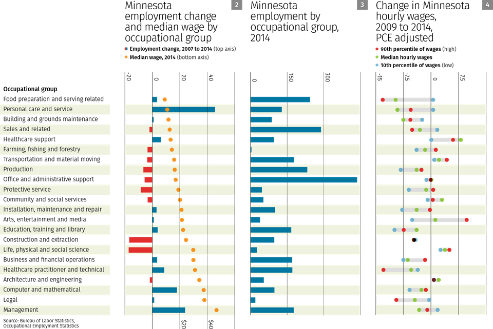
At the same time, two of the largest occupational job gainers—computer/math and management occupations—are among the top-paying occupations (by median wage); both groups are also in or very near the top half of occupations in total employment. Broadly speaking, occupational growth was stronger (more positive) among both lower-paying and (especially) higher-paying occupations; those occupations still below prerecession employment levels—like construction—were most often in the comparative middle of median wages.
The OES also offers an opportunity to look more closely at wage behavior. Commonly referenced wage data—from the Quarterly Census of Employment and Wages, or the Current Employment Statistics—track wages at the industry level, which encompasses a stew of occupations. These databases also tabulate average wages, which are surely useful but gauge wage behavior only in the middle; they offer no insight into wage behavior over the whole distribution of workers, and particularly at the high and low end, where much of the public’s attention currently is focused.
The OES does offer insights into wage behavior across the whole distribution of workers—albeit with all of the resident caveats that apply to occupational job counts, and then some. Ideally, any wage analysis should follow the same firms over time “or at least firms with the same characteristics,” according to Casale. But OES-based comparisons that should be at least three years apart give you a “fairly random draw” of firms with the exception of very large firms and government, she said.
With those provisos, OES wage data for 2009 and 2014 were gathered for 22 major occupation groups in Minnesota at the 10th (low), median and 90th (high) percentiles of wages. This allows for insights into how wages changed among and within occupational groups since the end of the recession.
These data suggest that, after adjusting for inflation, wages have been flat—or worse—throughout much of the wage distribution (see Chart 4). Among 22 occupations, there were nine occupational groups where inflation-adjusted wages fell at all three wage levels (10th/50th/90th percentile). Only four occupations saw inflation-adjusted wages rise over this period at all three levels. No wage level saw consistent wage growth among the 22 occupational groups.
Ron Wirtz is a Minneapolis Fed regional outreach director. Ron tracks current business conditions, with a focus on employment and wages, construction, real estate, consumer spending, and tourism. In this role, he networks with businesses in the Bank’s six-state region and gives frequent speeches on economic conditions. Follow him on Twitter @RonWirtz.