

Note1
Thank you very much for that generous introduction. It is a great pleasure to join all of you today as part of your regional data forum. As an economist and, almost by definition, a data geek, it is especially heartwarming to be here during this event. So thank you for the invitation. I would also like to especially thank those of you who took time from your busy schedules to meet with me and members of my staff this morning to discuss the Black Hills area economy and its challenges and opportunities. It is especially important for monetary policymakers to have a deep understanding of how the economy works, and one of the ways that we attain that understanding is through opportunities like this. The comments and questions that you all share, whether in meetings, over lunch, or in our question-and-answer session following this talk, all help to shape my thinking about the economy and policy.
I became president of the Federal Reserve Bank of Minneapolis in October 2009. One of my main objectives since then has been to make both the Minneapolis Fed and the Federal Reserve System more open and transparent. And I’ve been delighted to learn that I’m not at all alone in this pursuit of greater openness. I see many positive developments along these lines throughout the System, and especially on the part of the Federal Open Market Committee. The FOMC, as you no doubt know, is the monetary policymaking arm of the Federal Reserve. It meets every six to seven weeks to chart the course of monetary policy. The members of the Board of Governors and the presidents of the 12 regional Feds, including me, all take part in these meetings.
Today, I will talk about a significant improvement in the FOMC’s communication about monetary policy: In January 2012, the FOMC released a consensus statement describing its long-run framework. Congress has given the Federal Reserve a dual mandate: to promote maximum employment and to promote price stability. The January framework statement is important because it outlines the strategy that the FOMC follows in order to implement the FOMC’s dual mandate.
As you will hear, the framework statement provides a quantitative definition for price stability, through a numerical target for inflation. It does not do the same for maximum employment. I will spend a considerable amount of time discussing this latter aspect of the statement and its relevance for current policy.
Before proceeding, I’ll remind you that my remarks reflect my thoughts, and not necessarily those of others in the Federal Reserve System.
A brief history of Fed transparency
I’ll begin with some historical context. Over the past 30 years, central banks all over the world have become much more transparent about their objectives and how their current actions allow them to achieve those objectives. This transparency is widely viewed—by both policymakers and scholars—as an important means of enhancing the effectiveness of monetary policy.
Most central banks aim to keep medium-term inflation low and stable—at around 2 percent annually. They have been quite successful in achieving that goal over the past 20 or 25 years. They view that success as being due in part to their communicating on an ongoing basis how their current policy actions are consistent with that goal.
There are at least two benefits of transparency. The first is broadly appreciated: By being clear about their objectives, central banks are better able to achieve those objectives. For example, if the central bank’s announced inflation target is 2 percent per year, firms and employees know that wages need to grow by 2 percent to keep up with the cost of living. That knowledge helps prevent wages from growing so fast that firms have to raise prices by more than 2 percent to cover their costs—and that in turn contributes to keeping inflation under control. In brief, then, transparency helps anchor inflation expectations.
The second benefit of transparency is less appreciated, but no less important. A transparent central bank is more accountable to the public because it is forced to be more disciplined in ensuring that its policy actions are in fact consistent with its policy objectives. The central bank knows the public will be able to track its performance. When performance matches words, the public will have an even stronger belief in the central bank, which serves to anchor inflation expectations more solidly.
So, there has been a trend toward central bank transparency internationally. What about here in the United States? I think we can all take pride in the fact that under Chairman Bernanke and his predecessor, Chairman Greenspan, the Fed has made enormous strides in transparency. It is easy to forget that, as recently as 1993, the FOMC would act and not tell anyone for 90 days! It was not until 2000 that the FOMC began issuing the statement that many of us now take for granted. And it was a decade ago that the roll call vote of FOMC members was added to the statement. Thus, there has been substantial progress in monetary policy transparency over the past 15 or so years.
As of the beginning of 2011, the Committee had arrived at three main forms of communication. First, immediately after every meeting, the Committee issues a carefully worded, but brief, statement intended to describe the current state of the economy and the current stance of monetary policy. Second, three weeks after each meeting, the Committee issues a carefully worded set of minutes that provides a longer, but still relatively high-level, description of interactions within the meeting. Third, after the January, April, June, and October/November meetings, the FOMC releases a summary of economic projections. Among other things, these quarterly releases contain information about FOMC meeting participants’ goals for medium-run inflation and unemployment (roughly, over the next five to six years).
The framework statement
There have been several changes in FOMC communications over the past year, including the introduction of regular press conferences by the chairman and the regular release of FOMC participants’ individual assessments of the appropriate path of short-term interest rates. But I want to spend my time today discussing the change that I view as the most important: the FOMC’s release in January 2012 of a five-paragraph statement describing its long-run framework.
It is important to be clear that the statement does not represent any change in the Committee’s approach to policy. However, it does represent a major step forward in the Committee’s communication of that approach to the public. In particular, I think of this statement as providing the basic principles of how the Committee implements its statutory dual mandate that monetary policy should promote price stability and maximum employment. I won’t go through the statement in any detail. Frankly, there is no need for me to do so: It is short and remarkably well-worded, and it deliberately shies away from technical language. I encourage all of you—indeed, all Americans—to read it when you have the opportunity.2What I will do instead is describe four aspects of the framework statement that I view as especially important. The first key aspect of the framework is that it specifically translates the term “price stability” into a 2 percent target for inflation. The American public need guess no longer about the Federal Reserve’s inflation intentions—either on the upside or on the downside: 2 percent is our goal.
Second, the framework describes how the Committee weighs the two mandates— promoting maximum employment and promoting price stability—against one another. Importantly, it stresses that the two mandates are typically complementary, in the sense that keeping unemployment from rising too high also keeps inflation from falling too low. I think that this point is often under-emphasized in popular discussions of monetary policy.
Third, the framework enjoyed broad consensus support among meeting participants. This suggests that any changes in the framework will require the same level of broad consensus support. In this sense, one can think of the framework as being like a constitution.
I have moved quickly through the first three of these key elements of the framework statement—inflation target of 2 percent, the typical complementarity of the two mandates, and the quasi-constitutionality of the statement. This fourth key feature of the statement is that while it provides a numerical target for inflation, it does not provide a similar explicit quantitative interpretation of the second mandate: “maximum employment.” I want to spend the rest of my time discussing why it does not do so.
Estimating maximum employment
I’ll start with a quote from the framework statement itself: “The maximum level of employment is largely determined by nonmonetary factors that affect the structure and dynamics of the job market.” What are these nonmonetary factors? There are many, including population trends, the incentives built into the tax system, the incentives built into social insurance safety nets, the returns to human capital accumulation for young people, and simply social norms. The FOMC has no control over these nonmonetary factors. Its job is to attain the maximum level of employment attainable through monetary policy, taking these other nonmonetary factors as given.
It is important to note that the long list of nonmonetary factors includes nonmonetary policies. It follows that, even if employment is close to the maximum level that is achievable using monetary policy, there may well be nonmonetary policy levers that could be used to raise employment still higher. For example, suppose that Congress and the president choose to reduce the payroll tax paid by employers. Such a move would provide an additional incentive to employers to hire more workers (albeit at the cost of increasing the deficit), and increase employment and reduce unemployment.
All of these nonmonetary factors, policy or otherwise, fluctuate over time. Their changes in turn generate fluctuations in the level of maximum employment achievable through monetary policy—fluctuations that are often hard to gauge on a real-time basis. In what follows, I will spend some time describing why I believe that the Committee currently faces an especially large amount of uncertainty about the level of maximum employment that it can hope to achieve.
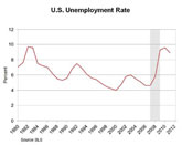
I’ll start by showing you graphs of four measures of the recent adverse changes in U.S. labor market performance. To understand the graphs, it’s helpful to recall that economists define the labor force to include all of those over 16 years of age who have a job or who have looked for a job in the past four weeks. All of the charts depict annual data through 2011.
The first graph depicts the evolution of the unemployment rate over time—the fraction of people in the labor force who have looked for a job in the past four weeks. The graph shows that after rising sharply from 2007 to 2009 (the shaded area indicates the recession period), the unemployment rate has been falling slowly.3

The next graph shows the evolution of the employment/population ratio over time—the fraction of people who have a job. To eliminate some of the possible demographic shifts that might otherwise influence this picture, the graph focuses on people between 25 and 54 years old, the so-called prime age population for the job market. We can see a sharp decline in this ratio from 2007 to 2009. And, in contrast to the unemployment rate, there has been no noticeable recovery in this measure.

The third graph is a depiction of the fraction of the population between ages 25 and 54 who are in the labor force—that is, they either have a job or have looked for one in the past month. Economists refer to this as the labor force participation rate. An interesting aspect of this graph is that this fraction has tended downward since the late 1990s. This downward path has accelerated since 2008.

The final graph depicts the relationship of unfilled job openings and unemployment over time. The horizontal axis shows the unemployment rate. The vertical axis is the job openings or vacancy rate—the ratio of job openings to the sum of employment and job openings. Each point on this graph corresponds to a different year, and represents the average unemployment rate and the average vacancy rate in that year.

When the economy is doing well, firms usually hire more workers and they find it more challenging to fill their available openings. Hence, the unemployment rate is low, and the vacancy rate is high. So, typically, as the economy improves, the plotted points move toward the upper left in this picture. Conversely, when economic times get worse, the plotted points move to the southeast. This creates a curve that runs from the northwest to the southeast—a curve that’s known as the Beveridge curve.
However, in the Great Recession and its aftermath, we have seen something different: The Beveridge curve itself has shifted out toward the upper right. Economists see this kind of outward shift as representing a decline in the ability of the labor market to form mutually beneficial matches between workers and firms. In that sense, the labor market is less efficient. The outward shift means that firms can’t fill their available job openings as readily as we would have expected in light of the high unemployment rate.
To summarize: Labor market outcomes do remain notably worse than prior to the recession. The good news is that the unemployment rate has been declining since the end of the recession. But there is also countervailing evidence: The labor force participation rate has been falling steadily, and the employment/population ratio remains near its low point. The Beveridge curve shows considerable deterioration in labor market matching efficiency.
How persistent will these changes in U.S. labor markets prove to be? Economists hold at least two views on this question. The first is guided by the patterns in post-World War II data for the United States. These patterns suggest that the current deterioration in U.S. labor market performance is indeed reversible under appropriate policy.
The second view is less sanguine. It says that the post-World War II data do not contain an economic crisis of the kind or magnitude that hit the United States in 2008. Such a crisis could well have a different kind of impact on labor markets than the earlier postwar recessions.
The Swedish experience
This latter view is also informed by data from other countries—not just the United States. My staff and I have recently taken a close look at data from Sweden.4 Why Sweden? In the early 1990s, Sweden was hit by a financial, banking, and currency crisis—what one might term a triple crisis. Of course, other industrialized countries—perhaps most notably Japan—have experienced these kinds of crises. My staff and I have focused on Sweden because it is generally viewed as having dealt with this triple crisis in a highly effective fashion. For example, in 2007, OECD economists wrote, “Sweden’s economy has made a remarkable recovery from the major crisis of the early 1990s,” in emphasizing Sweden’s rapid productivity growth in the previous two decades.5
Despite this success, the triple crisis had a profound and highly persistent effect on the Swedish labor market. To see this, let’s look at graphs for the same four variables in Sweden that I showed you earlier for the United States.6 I’ve shaded the period 1991-93 in these graphs to indicate the heart of the triple crisis period in Sweden.
The first graph depicts the Swedish unemployment rate. From 1980 to 1990, the unemployment rate had never been above 4 percent and was typically closer to 2 percent. After 1993, the unemployment rate was never much below 6 percent.

The second graph depicts the Swedish employment/population ratio, again for those between ages 25 and 54. From 1980 to 1990, the employment/population ratio grew steadily in Sweden and peaked at over 91 percent. After 1993, the ratio trended upward slightly but remained below 86 percent for most of the period.

Next, we see the evolution of the fraction of Swedes aged 25-54 years who are in the labor force. From 1980 to 1990, this fraction rose to a high of over 92 percent. After 1993, it was typically around 88 percent and never much above 90 percent.

Finally, we can look at the Beveridge curve—the joint evolution of unfilled job openings and unemployment. The Swedish Beveridge curve shifted outward from 1990 to 1995—and that shift has endured through at least 2010.

To sum up: These four measures of Swedish labor market performance declined markedly after the triple crisis of the early 1990s. At least up until now, this decline has proved to be permanent. I should note too that these changes happened over a remarkably short span. In its February 1995 inflation report, the Riksbank, the Swedish central bank, suggests that the rate of unemployment that they viewed as sustainable over the long run had risen from 2-3 percent to 6 percent in less than five years.7 Their assessment—again, made in 1995—has proven to be a remarkably accurate characterization of how Swedish labor markets functioned over the next 15 years.
It is important to emphasize that, of course, there are many institutional differences between Sweden and the United States, especially in terms of tax systems and social safety nets. It would be a mistake to conclude from the Swedish data alone that the recent decline in U.S. labor market measures is inevitably a permanent one. But Sweden is not atypical. Cross-country research from Reinhart and Reinhart (2010) has found that financial crises tend to be followed by sustained increases in unemployment.8
Hence, I do think that the Swedish data—given that they come from a country generally regarded as an exemplar of how to handle a financial crisis—have to be viewed as informative. At a minimum, Sweden’s experience forces us to contemplate the possibility that the erosion in labor market performance that we’ve seen in the United States over the past five years may be highly persistent, even under appropriate monetary policy.
Policy implications
Over the past ten minutes or so, I have talked about the recent adverse changes in U.S. labor market performance. I have discussed two sharply different possible ways to view those changes: first, that they are largely reversible under appropriate monetary policy and, second, that they are likely to be highly persistent. These two possibilities suggest that the FOMC is confronted with an unusually high degree of uncertainty about the level of “maximum employment” it can achieve. This uncertainty translates directly into a corresponding uncertainty about the appropriate approach to policy. In particular, policymakers who see the deterioration in labor market performance as reversible using monetary policy will typically favor more accommodative policy than those who view the deterioration as more protracted.
Fortunately, we can use other sources of information to reduce the level of uncertainty about the maximum level of employment achievable through monetary policy. “Maximum employment” for monetary policy is widely interpreted as the level of employment that is sustainable through monetary policy actions without an acceleration in inflation. While we cannot directly observe “maximum employment,” we do observe inflation, and its behavior is a useful signal of how close we are to the maximum level of employment achievable by the FOMC.
So, what has been happening with inflation? Inflation was distinctly higher in 2011 than in 2010 and continues to run above the FOMC’s target of 2 percent. Even core measures of inflation, which strip out energy goods and services, and food, went up notably. I see these changes as a signal that our country’s current labor market performance is much closer to “maximum employment,” given the tools available to the FOMC, than the post-World War II U.S. data alone would suggest. As I’ve argued in the past, appropriate monetary policy should be responsive to such signals.
It is worth reiterating a point that I made earlier. “Maximum employment” for monetary policy is not the same as “maximum employment” for all policymakers. Congress and the president can choose to provide direct subsidies to employers for hiring. Such subsidies will increase the federal deficit, but they do have the power to increase “maximum employment” for the FOMC.
Conclusions
Let me wrap up. The overarching theme of my speech has been monetary policy transparency. I pointed out that the FOMC has made major strides toward greater transparency in recent decades, and especially over the past two years. These steps mean that we are more accountable to the public and more effective as policymakers. It is especially noteworthy that in our January framework statement, the Committee has set a clear quantitative objective for our price stability mandate: 2 percent inflation per year.
I believe that all Americans can take great pride in the improvements in FOMC communication over the past 15 or so years. But there is still more that can be done (of course!). Too often, our communications about the future course of the economy imply considerably more certainty than we can possible have. We should be more transparent about the uncertainties that we face as policymakers. We can and should use scenario analyses to describe how our policy will respond to new information about those uncertainties.
Along these lines, we can learn from the practices of other central banks. For example, in today’s talk, I spent a great deal of time discussing the uncertainties associated with formulating a quantitative measure of “maximum employment” for the FOMC. An interested Swedish citizen would have been able to read many rich and detailed discussions of exactly this issue in the Swedish central bank’s monetary policy reports in the mid-1990s.
Thanks for listening to my remarks. I’ll be happy to take your questions now on these or any other topic that might occur to you.
Endnotes
1 I thank Douglas Clement, David Fettig, Terry Fitzgerald, and Kei-Mu Yi for their contributions to these remarks.
2 See the Jan. 25, 2012 press release.
3 All U.S. data are from the Bureau of Labor Statistics. The vacancy rate data are the job openings rate data from the Job Openings and Labor Turnover Survey.
4 My thanks to Terry Fitzgerald and Brian Holte for this research. Also, see “Reforming the Welfare State: Recovery and Beyond in Sweden,” National Bureau of Economic Research (2010), and especially papers therein by Ljungqvist and Sargent, Forslund and Krueger, and Davis and Henreksen.
5 See the March 2007 OECD Policy Brief.
6 All Sweden data, except the vacancy rate data, are from the Organisation for Economic C-operation and Development. The harmonized unemployment rate is used. The vacancy rate is calculated using unfilled vacancies data from Riksbank and total household employment from statistics Sweden.
7 See the Riksbank February 1995 report, page 23.
8 See “After the Fall.”

Monetary Policy Transparency: Changes and Challenges
May 10, 2012
View video of the speech and the
Q & A that followed.