It’s a tough economic world out there today.
 You don’t have to bury your nose in the news very long before you get the idea that middle class America today is like a ball of Play-Doh in the hands of a child; it’s getting squeezed, pulled, hammered, cut, pinched, rolled, tossed around and, finally, left out to dry.
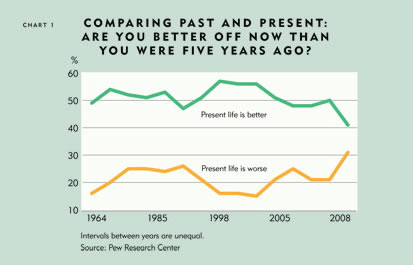
Across the Ninth District and nation, people fret that the middle class lifestyle many simultaneously aspire to and feel entitled to is becoming harder to reach and more difficult to hold on to—a notion reinforced by official government statistics and repeated like economic waterboarding by journalists, bloggers, pundits and politicians.
Gone are the wistful days of the 1960s and 1970s, when it seemed that everyone—well, every dad at least—had a good manufacturing job that paid enough for mom to stay home and for the family to afford all the trappings of middle class life: a house in a decent neighborhood, good health care, paid vacation, a pension to retire on and college for the kids.
So much for nostalgia, right? Government data portray a stagnant middle class. And like the saying goes, if you’re not getting ahead, you’re falling behind. It’s enough to make a middle class guy mutter a few no-class expletives.
But what if all this isn’t true, or is only partially true? What if the middle class in the Ninth District is continuing to get ahead, particularly in the big picture? This fedgazette article takes a close look at changes in middle American income, wages and living standards since 1979 in Ninth District states and finds that middle class living might not be as bad, threatened or besieged as is commonly portrayed.
A look at income malaise
The first step in this analysis is a palate cleanser: Back away from today’s challenging economic environment to get the big picture. Clearly, many people are suffering from various maladies stemming from rising unemployment, higher inflation and the current housing crisis. But examining the progress of the middle class over the long haul gives a broader, less emotional view of generational change.
From this bird’s-eye perspective, there are many ways to compare income growth over time, each of which paints a different picture. Trends in per capita income growth since 1979, for example, are quite positive. In each district state, average income per person went up by at least 50 percent in real (or inflation-adjusted) terms; in Minnesota, it leapt by 71 percent. But average income masks the distribution of those gains, and much of that new income went to top earners, thus inflating the overall average.
That’s why researchers often prefer the median measure—or the exact middle observation—as a good proxy for how the average Joe in the middle class is doing. And by median standards, he hasn’t done all that well over the past couple of decades. The Economic Policy Institute reported that nationwide median hourly wages grew a scant 10 percent from 1979 to 2006; the U.S. Census Bureau reported an almost-as-scant 13 percent increase in median household incomes.
What’s to argue over, except for the crumbs of this paltry growth? Plenty, because commonly used measures of income and wages understate the long-term gains made by middle class households and workers. Official government data haven’t necessarily been wrong; they might more accurately be called incomplete, because important considerations are excluded, overlooked or improperly estimated. Factoring in these items boosts wage and income growth considerably, at both the national and district levels.
For example, many reports that fret over sluggish income growth adjust for inflation using the consumer price index. Though logical at face value, the CPI has long been criticized—for example, by the Boskin Commission in 1996—for likely overstating inflation, possibly by as much as 1 percent or more per year. The personal consumption expenditures deflator (used in this analysis) is widely believed to be a more accurate gauge of inflation over time. Such a matter might seem trivial, but in the long term it becomes significant. When income figures are adjusted using the PCE, nationwide median household income growth from 1979 to 2006 jumps to 20 percent—seven percentage points higher than the same income figures that use the CPI.
For the Ninth District, moving from CPI-adjusted income to PCE-adjusted income pushes median household income growth over this period from 10 percent to 17 percent. (All figures hereafter are PCE-adjusted.)
Income gains differed considerably among district states; household income grew by 32 percent in South Dakota and 24 percent in Minnesota, compared with meager growth of between 8 percent and 12 percent for Montana, Wisconsin and the Upper Peninsula of Michigan (see Chart 2).
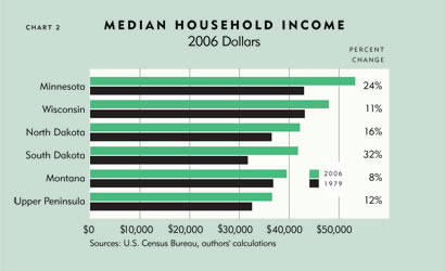
The gains for most states are not particularly robust, especially when compared with earlier periods. From 1969 to 1979, for example, every district state except Wisconsin saw median income grow between 9 percent and 19 percent (Wisconsin trailed at 5 percent).
Compositional effects
But there are additional measurement issues to consider that further clarify the gains that have been made by the district’s middle class. For example, one might think that a household is a household, and comparing those from different periods would be a reliable barometer of change and improvement. But the composition of households has changed significantly over the years. As a result, the median household today is different from the median household circa 1979. Those differences have a marked effect on income and, by extension, any growth trends attached to it.
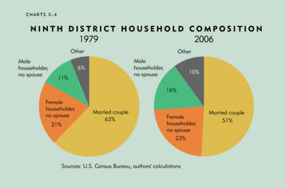
For example, married couples in the Ninth District made up 63 percent of all households in 1979; female and male householders (with no spouse present) were 32 percent of the total, and all other households (for example, multifamily, unrelated adults) accounted for the remaining 6 percent. (Figures exceed 100 percent because of rounding.)
Now fast-forward to 2006: Married couples in the district made up 51 percent of households, female and male householders 39 percent, and all other households 10 percent (see Charts 3 and 4). This is important because the income of a household is closely associated with the characteristics of the people living in it, the most predictive of which are educational attainment and the presence of a married couple. Married-couple households in the district, for instance, earn more than twice as much as either female- or male-headed households. So as the share of the highest income group (married couples) gets smaller, the median observation automatically moves toward a household subgroup that traditionally has a lower income.
Here’s a simplistic example to illustrate the effect of household composition changes. Suppose there are 10 people (five men and five women) each making $34,000 per year, and together they make up six households: four married couples with household incomes of $68,000, one male- and one female-headed household, both with income of $34,000. The middle income observation for these six households is $68,000, the income of a typical married couple.
The next year, one of the married couples is divorced. That leaves three married households and four single-headed households—two headed by men and two headed by women. Now let’s say every person gets a 10 percent pay raise. Is everyone better off? You certainly could argue that. But because of the compositional shift, the median for these seven households plummets to $37,400 because the middle-ranked observation (with the raise) is now a single-headed household.
This example exaggerates the actual decline in married couples, but it demonstrates why the overall household median can be misleading. In the district, every state saw a decline in married households roughly in line with the national trend.
Comparing neighborhood castles
Given these subtle socio-statistical influences, analyzing similar household subgroups offers a better apples-to-apples comparison of economic progress over time. Such a comparison shows greater positive income gains in the Ninth District—between 20 percent and 45 percent for most household types, though there are large differences among subgroups and among district states (see Chart 5).
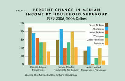
For example, married households in the district (still easily the largest subgroup despite its decline) saw median income gains of 32 percent from 1979 to 2006. That growth, for married households with and without children, was 15 percentage points greater than the district’s overall (adjusted) median income growth of 17 percent. Gains were higher for married households in all district states, but again there were notable differences, ranging from 45 percent in South Dakota to 16 percent in Montana.
Female-headed households also saw larger income gains than the overall district median. Their income jumped 35 percent over 1979 levels, raising incomes to a still comparatively modest level of $24,000 in 2006. However, such households with children saw much slower growth of 17 percent.
Male subgroups consistently trailed the rest of the field. Male-headed households in the district saw their income rise just 13 percent; more ominously, males with children saw their income decline by 7 percent. (Breakouts of smaller subgroups at the state level, like males with kids, are hindered by a lack of reliable samples in small states like Montana and the Dakotas. However, district averages include all observations from these states.) Yet despite sluggish growth, median income of male householders is still significantly higher than their female counterparts, who saw strong income growth.
Data geek squad
That’s still not the whole income story; in fact, household income growth was likely stronger still from 1979 to 2006 than even adjusted figures here reflect, because data do not accurately account for all forms of income. More to the point, household income data exclude certain kinds of compensation that have been growing rapidly.
Here’s how: The federal government measures household income in several ways. The two most prominent are money income (used in this analysis) and personal income. Money income, put together by the Census Bureau, is basically what it sounds like—income received as money. This includes wages, pension income, stock dividends and so forth. It does not include employment-based fringe benefits like health care coverage and retirement contributions paid for by employers, which are a critical underpinning of the middle class lifestyle. Equally important, these excluded items grew rapidly over the past 30 years. For example, health care benefits paid by employers rose by 250 percent per person, after adjusting for inflation.
On the other hand, personal income (the other commonly used measure) is a broader gauge of total income and includes nonwage benefits and other compensation that contribute to a household’s well-being. Growth in personal income exceeds that of money income by about 10 percentage points over the period studied in this analysis, which suggests that real median household income has grown more than Census money income figures indicate.
Unfortunately, household data on nonmonetary income are not available. However, a conservative back-of-the-envelope calculation suggests that median household income growth that included such compensation would be at least 5 percentage points higher.
Adding up these three adjustments—for PCE, composition and missing compensation—brings median household income growth for most household types in the district to a range of 25 percent to 50 percent—well above the 10 percent median increase we started with, and pretty strong evidence that middle America has not stagnated over the past generation.
Wagering some growth
Those concerned over middle class progress also seize upon median hourly wages as a measuring stick, which reinforces the notion of stagnation even more than analyses based on household income.
District states saw very modest hourly wage gains of 14 percent from 1979 to 2006; median wages in Montana saw no gains, and the Upper Peninsula of Michigan had a very small gain (see Chart 6). Such figures bolster the common argument that the good old days when a person could get a family-supporting job out of high school are long gone.
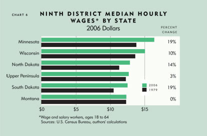
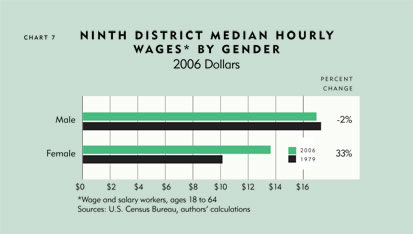
But as is the case with median household data, a lot of caveats tag along with any conclusions. For instance, median hourly wages mask the variation among subgroups. Females had much larger increases in median wages, while male wages were roughly flat. Furthermore, college-educated groups saw much larger gains than less-educated groups, which had small or negative gains (see Charts 7 and 8).
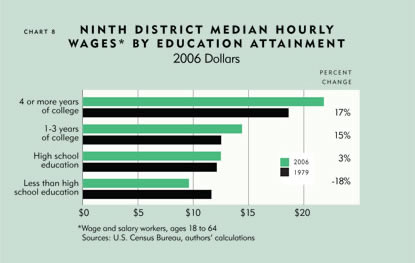
And again there are compositional changes to consider. In district states, workers with at least some college increased from 39 percent in 1979 to 64 percent in 2006. So in 1979, a high school diploma denoted a better-than-average education, which often translated into higher wages. Today, simply finishing high school puts the worker roughly in the bottom one-third of all workers for educational attainment, and wages have reacted rather predictably. To expect otherwise ignores the value of education on worker productivity.
As with household income, there are other technical reasons why median wage data probably don’t fully reflect what people are really earning. For example, commonly cited “average hourly earnings” data from the Bureau of Labor Statistics cover only production and nonsupervisory workers, a narrowing sector of the overall economy that has seen less wage growth than other labor groups. In fact, the data are unrepresentative enough that the BLS is expanding the AHE series to include data on all employees, and plans to reduce or eliminate data on only production and nonsupervisory workers.
Similar to median household income, hourly wage data also do not include nonwage income, which now makes up 30 percent of total worker compensation, according to the BLS. Research in the September 2007 Region magazine (also published by the Minneapolis Fed) estimates that total compensation growth—wages plus benefits—was about 8 percentage points higher than wages alone during 1975–2005. (See also the September 2008 Region for a closer look at household income in middle America.)
Lost (income) generation?
While people’s income appears to have grown more than is often recognized, it has not likely grown as strongly since 1979 as it did during the preceding 30 years, especially for certain kinds of households and workers.
The point of this analysis is not to bury or deny gains of the distant past, nor gloss over what’s happened since. The intent is to help frame the discussion. Reportedly sluggish income growth is the source of considerable angst. That anxiety gets compounded in tough economic times—like the current environment, where unemployment and inflation are rising, and public confidence is falling. In the midst of this, it’s not surprising that people question economic progress.
Too often, however, short-term trends are overlaid onto long-term, generational trends. Growth never proceeds in a perfectly straight or universally upward fashion, which is something the nostalgia for the good old days fails to recollect. While the past 30 years might not have been the apex of middle class progress in America, it’s also misguided to believe that middle class progress has stalled over the past three decades.
The long-term snapshot from different anglesThe choice of time frame—the starting and ending points—leaves a subtle but distinct impression on any trend analysis. But rarely are there obvious dates or a time frame that both the half-fulls and half-empties can agree on, because shifting the dates merely creates different implications. For example, much of the attention given to middle class wages and income focuses on the short term, typically the period since about 1999, when strong growth began to wane leading into the 2001 recession. Between 1999 and 2006, median household income as reported by the U.S. Census Bureau declined by 2 percent nationwide, and was negative for Minnesota and Wisconsin and very modest for the Dakotas and Montana. That certainly feels stagnant—maybe worse. While such short-frame analysis is neither inappropriate nor inaccurate, it can be misleading. Income growth tends to be dynamic and cyclical; it doesn’t steadily rise, instead accelerating for a time and then slowing down, often in sync with business cycles and other short-term economic fluctuations. From 1989 to 2000, for example, median household income in the United States rose 8 percent. But a closer look shows that median income remained flat from 1989 to 1996, then leapt 8 percent in the remaining years. Indeed, the 1979–2006 time frame comes with its own caveats. For starters, it leaves out the two most recent years—which have been a struggle for many—only because detailed income data were not yet available at the start of this analysis. But 1979 is also a very conservative—or high—starting point. That date was chosen because it was a census year, which offers rich household data at the state level. But it was also an economic high point, just before the onset of a high-inflation, recessionary period. Moving the starting date by a few years in either direction would have set it before the start of a high-growth period (the late 1970s) or just after a period of very slow growth (the early 1980s), which would have modestly, but noticeably, increased growth rates. —Terry J. Fitzgerald & Ronald A. Wirtz |
Related articles: Supersize me
Just what is the middle class and other stuff
Has Middle America Stagnated?, The Region, September 2007
Ron Wirtz is a Minneapolis Fed regional outreach director. Ron tracks current business conditions, with a focus on employment and wages, construction, real estate, consumer spending, and tourism. In this role, he networks with businesses in the Bank’s six-state region and gives frequent speeches on economic conditions. Follow him on Twitter @RonWirtz.


